By
By 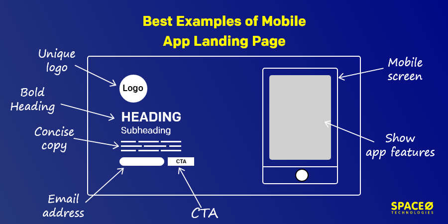
Do you easily convert your website visitors into customers? Well, the statistics show that the conversion rates are really low for most landing pages. According to Wordstream, the average mobile landing page conversion rate is only 2.35% across industries. The top 25% have a conversion rate of 5.31% or higher.
Being an app and web development company, our clients enquire about how to design a landing page for a mobile app/ website that brings in more leads. We decided to write this blog to answer some major questions like what is a landing page, what is needed on a landing page, which is the best mobile app landing page examples and how is a landing page different from a website.
What is a Landing Page?
You may guess from the name, a landing page is a webpage where a visitor ‘lands’ after clicking a link. Now, it can be a blog post, a homepage, or a portfolio. But, the landing page is different. It is a standalone page, different than a website, that people use to digitally promote their products and services, and convert the traffic into customers.
We’ll see the examples to better understand landing pages but before that, let’s get our basics clear. We’ll talk about the important components that make up a landing page.
Important Elements of a Landing Page?
Name and Logo
Whether it is live on the internet or not, you need to have a catchy name and an interesting yet simple logo for your brand.
Headline
The headline should be bold, clear, and grab the user’s attention.
Subheading
If you need to explain more about your product, you need to add a concise copy that gives a gist of your services. Also, you must keep the subheading above the fold.
Video Integration
This component is not mandatory on a landing page for a mobile app however could be of great use if you are creating a mobile app landing page. A video could easily explain what the mobile app is about and how the users could benefit from using the mobile app.
Call To Action
A call to action or a CTA may be a contact form or just one button that leads to another page. The design and content of a CTA are extremely critical as this is the button that leads to conversion.
Let’s now move on to the examples of best app landing pages.
13 Best Mobile App Landing Page Examples
We are obsessed with mobile application and mobile app design. We went through hundreds of landing pages for mobile apps and gathered 13 of our favorites of mobile app landing page for you.
| Name Of The App | What Did We Like Best? | Website |
|---|---|---|
| Houseparty |
| N/A |
| Headspace |
| |
| Slowly |
| |
| Any.do |
| |
| InVision |
| |
| Uber |
| |
| Keeply |
| N/A |
| Netflix |
| |
| Glovo |
| |
| Camera+2 |
| |
| OkCupid |
| |
| Olmo |
| |
| Ziago |
|
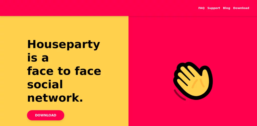
Houseparty

Source: Houseparty App
What did we like best?
Logo: The logo is placed in a different location than the text. The size of the logo is also bigger than the usual mobile app landing page. This fits the page design and makes it look very unique.
Animation: The hand on the right side is the logo for the app. It also waves as if to call someone to a party. This is a very smart way to use the logo, attract the user’s attention, and give a hint of the app’s purpose.
CTA: The CTA is very a simple download button and just says ‘Download’. When you click on it, it scrolls down to the last part of the page and displays four options viz. Android, iOS, macOS, and Chrome. You can download the version your device is compatible with.
Headspace

Source: Headspace App
What did we like best?
Logo: The logo couldn’t have been simpler. It is just an opaque circle of orange color. The app is for meditation and sleeping, nothing too complex. The logo is perfect to show the simplicity of the app’s purpose.
Design: Orange color is repeated on the landing page as well as in the app itself. This is done for consistency. The pictures used are simple and the main image gives us a soothing feel.
Subheading: ‘Stress less. Move more. Sleep Soundly.’ is simple and catchy. The copywriter has used a combination of rhyme and alliteration which makes the subheading easy to notice. Just six words explain what the mobile app is all about.
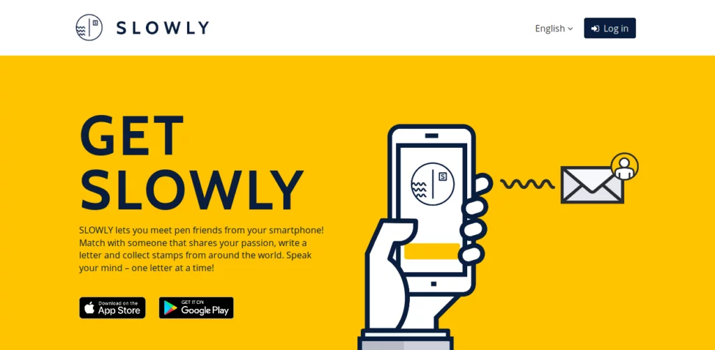
Slowly

Source: Slowly App
What did we like best?
Logo: This is one of our favorite logos on this list. This circular logo denotes a letter where the waves represent the address line and the ‘S’ in the box is a stamp and stands for Slowly. This is a creative way to tell the user about the mobile app’s purpose.Heading: The heading ‘Get Slowly’ functions two ways here. First, it tells the visitors to “get ” the Slowly app. Second, it hints at the aim of this mobile app, to make pen friends slowly. Again, a really smart work of copywriting.
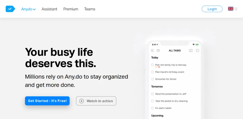
Any.do
Source: Any.do App
What did we like best?
Logo: The logo is small, which is the only minus point. However, it shows a little checkmark that denotes the completion of a task on a to-do list. A very common symbol but fits perfectly with the app’s use on the landing page for mobile apps like these.
Video Integration: The button text ‘Watch in action’ is very appealing. When you click on this button, you will see how this mobile app works. The app has a lot of features and a video is the best option to explain users easily and attract them.
InVision

Source: InVision
What did we like best?
CTA: The CTA is not an entire contact form but just one field for an email address. It is a very smart way to get the most important detail- the user’s contact information. the button that says ‘Get Started- Free Forever’ assures you that you will always get free services.
Chat Icon: The chat icon has the brand’s logo on it. The color of this is in contrast with the background color, making it easily visible for you.
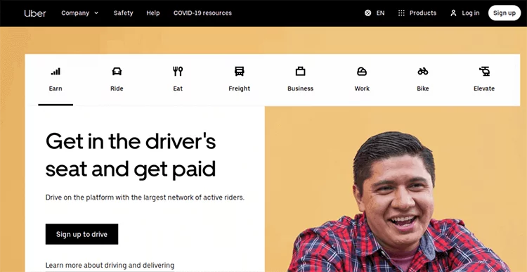
Uber

Source: Uber App
What did we like best?
Icons: The screen has 8 icons that symbolize 8 main functions of the mobile app. The icons are minimalistic and yet explain their purpose clearly. When you click on any icon, the entire content along with CTA changes to explain that particular function.
CTA: The text on the button also changes when you click on the icon. For instance, it shows ‘Sign-up to drive’ when inviting drivers to collaborate and earn and to ‘Request now’ and ‘Schedule for later’ when you click on Ride and asks the users to book a ride
Want to Hire App and Web Designers?
Looking to hire app and web designers for your project? Contact us today

Read Here: Winning Strategies of Netflix
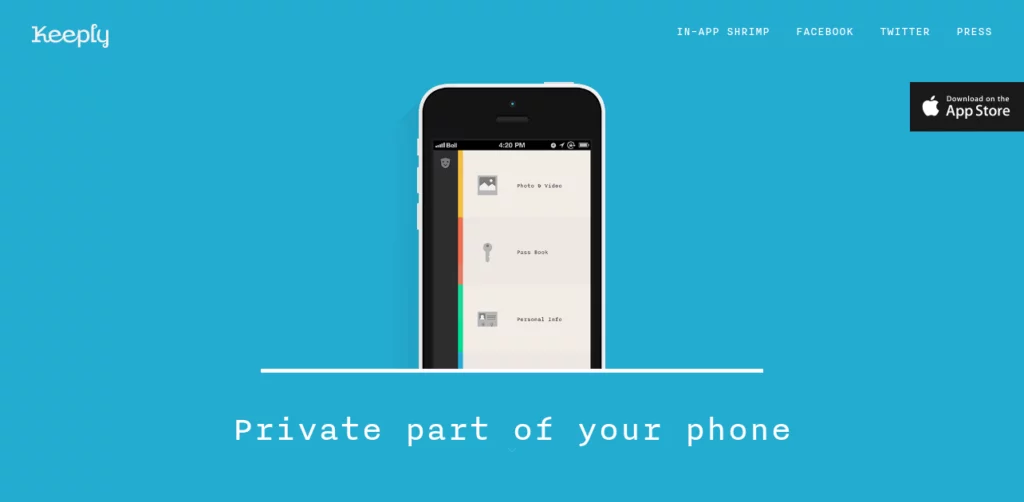
Keeply
Source: Keeply
What did we like best?
Name: The name of the mobile app is ‘Keeply’ which is placed in the top left corner of the mobile app landing page. It is a simple name that represents the mobile app’s goal quite aptly. It ‘keeps’ photos, videos, bank details, and personal information safe.
Main image: The main image is right in the middle of the mobile app landing page. It shows a mobile phone screen with the Keeply app open and showing the key features along with the small logo on the top left. The images or app screenshots are sufficient to explain the purpose of the app.
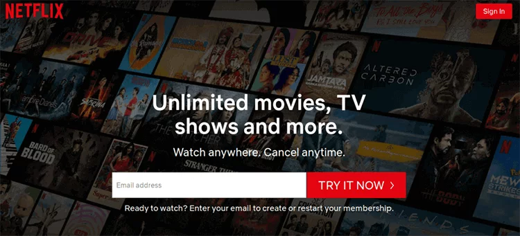
Netflix

Source: Netflix
What did we like best?
Name: The word Netflix is made up of two words- the Internet and Flicks. ‘Flicks’ is slang for movies and as it is an online movie rental and subscription service the word ‘Net’ is added in the first half of the name. The name is easy to spell, pronounce, and also catchy.
Background Image: Instead of saying that we have a great collection of movies and TV shows, Netflix shows this fact by putting numerous posters of popular movies and web series. This is a really creative way of putting forth a point without using too many words.
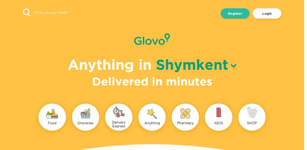
Glovo
Source: Glovo App
What did we like best?
Heading:
This is one of our favorite headings. It says “Anything in Shymkent v“. When you click on Shymkentv, a drop-down menu opens with other city names where Glovo provides its services. A very intelligent and creative way to show where you will find the services.Images: Glovo has very tactfully used high-quality images to show you the services it provides. When you click on any of the images like on ‘Food’ image or ‘Groceries’, it will lead to another page where you can buy anything and get it delivered anywhere in the city you choose.
Camera+2

Source: Camera+2 App
What did we like best?
Background: If you look at a simple app landing page, most chances are that it has a lightly shaded background. Camera+2 took the opposite way and has a pitch-black background with white and yellow font. The mobile app claims to elevate photography skills and this background gives it an elegant look that goes with the theme of the beautiful app landing page template.
Main image: The yellow checkered background gives the feel of a grid used in many photo editing tools. The mobile screen shows the key features of the mobile app, telling you about what you’ll get if you download the mobile app.
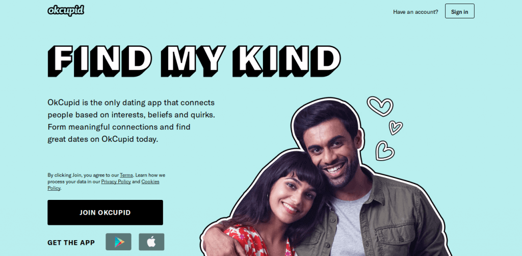
OkCupid
Source: OkCupid App
What did we like best?
Heading: The heading on this beautiful app landing page says ‘Find My Kind’ which hints at the app’s motto of helping users find a date or a partner with similar tastes and habits. It is a sweet and simple heading that suits a mobile dating app of this kind.
Subheading: This is a classic example of an old-school subheading. It is right below the heading and above the fold. The copy is concise and simple to understand. When you read this content, you will have no doubts about what the app is meant to do fo you.
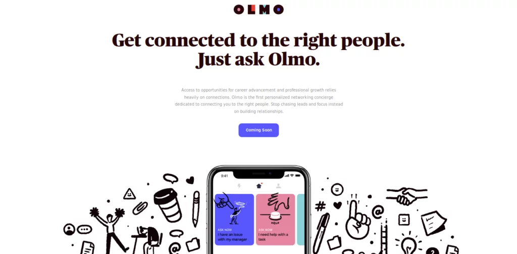
Olmo
Source: Olmo App
What did we like best?
Heading: The heading ‘Get connected to the right people. Just ask Olmo’ is longer than traditional headings but placed perfectly according to the mobile app landing page design. This helps to make sure that the visitors understand the product in just one go.
Animation: When you hover the cursor over the small images surrounding the mobile screen, they move and wobble slightly from their place. It is a smart way to attract a visitor’s attention and make them stay longer on the page. While the visitors are at it, they will also read about the product even before it has come out.
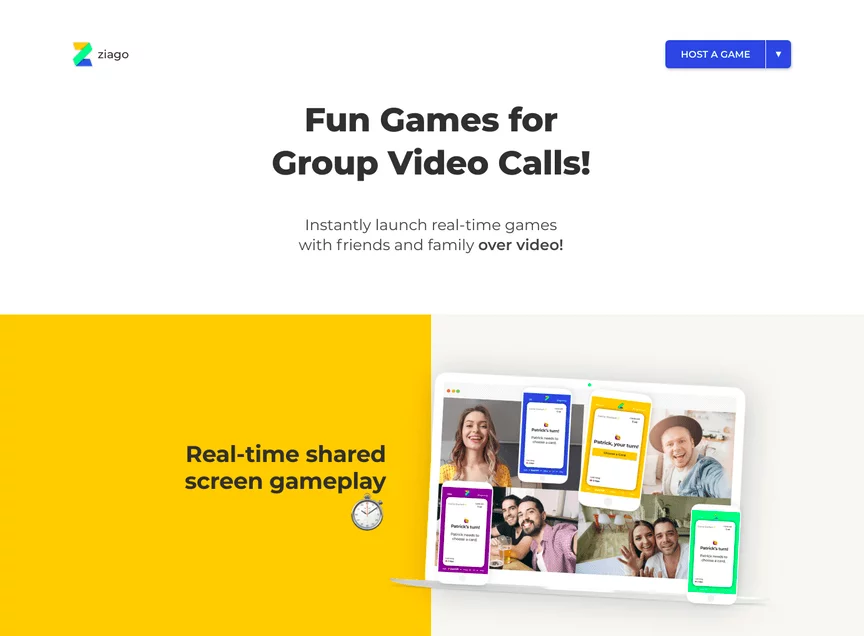
Ziago

Source: Ziago
What did we like best?
Image: The image shows a bunch of people having fun while playing games on Ziago. It seems like they are talking to each other and enjoying themselves. This makes an impression in your mind that even you should lay a game with your close
CTA: The CTA of this mobile app landing page is placed at a unique location- on the top right corner of the page. It says ‘Host a Game’ and when you click on it a drop-down menu opens with a list of games. You can select any game, enter your name, and send a link to friends and family to start the game.
Want to Hire Mobile App and Web Designers?
Looking to hire mobile app and web designers for your project? Contact us today
Let’s now take a look at the answers to common questions we get asked about.


Frequently Asked Questions
What’s the difference between a landing page and a website?
The website is a collection of webpages and every web page needs specific files stored on a host computer. Whereas, landing pages are standalone webpages. They are made for advertising or marketing campaign for a product or service. A landing page has only one goal- converting visitors into customers.
Where can I find mobile app landing page designs and inspiration?
You can find a lot of mobile app landing page templates and ideas from the following sites:
- Landingfolio
- Dribble
- ThemeForest
How can I create a landing page with great web design?
Here are a few best practices that you could follow to create a landing page:
- Keep the logo minimalistic and unique
- Keep the heading self-explanatory
- Keep the copy concise and simple
- The content above the fold should be perfect
- Keep the design simple and elegant
- Keep a unique call-to-action or a download link for Google Playstore or Apple App Store
- Make sure the page loads fast so keep the images or mobile app screenshots of small size
Conclusion
We hope that this article has helped you understand the basics of a mobile app landing page design. We also hope that these examples of the best mobile app landing page have inspired you to create your own mobile app landing page. Let us know your favorite landing pages that we should add to the list. We will keep adding new pages for your inspiration.
We are a leading mobile app and a PHP web development company with experience in developing mobile apps like Glovo– most downloaded food and grocery delivery in Spain, Photo Translator– an AI-based OCR app that converts the image into text, and websites like Tomouh- a platform to bring together leading personalities from various fields. If you have any queries about landing page, website, or mobile app design, feel free to contact us. Just send us an inquiry and we will reach out to you at the earliest.
Useful resources